AI Ready — Or Just Using AI?
Take the AI Readiness Assessment →


We are excited to announce a big moment in our product journey — the public beta release of Accelo v4! After many quarters of research and hard work, we are eager to share the next evolution of Accelo with our incredible users.
In this article, you will find details about what this beta contains, instructions on how to activate it, how you can provide feedback, current known feature limitations and an outline of what’s next.
If you're interested in getting a zoomed-out view of how this beta fits into our overall plans for Accelo v4, check out the Accelo v4 Progress Update companion post, also published today.
As you can see in the image below, there is a new structure to all the new Accelo v4 screens. Towards the top of each screen, you will see a universal Info Bar and Hub. These elements are meant to bring you the most important fields about your work above the fold of the page. The bar along the width of the page is the Info Bar, which will have in-line editable fields.
On the left end of the Info Bar, you will find a down arrow button that opens up the Hub. Inside of the Hub are secondary, but still important, fields related to the work you are viewing. This is designed to keep the power of Accelo while reducing complexity for casual users.
If at any point you need to do something that the beta doesn’t support, you can select the “Classic View” button.
You will find that the Overview tab of each new view screen has been restructured. The Overview will be the main hub of each work screen, giving you the most important information in different sections of the tab. To complement the Overview tab, there is also a new and improved Details tab on each view screen. This will house all of your custom fields as well as other types of information about the work that you deem important.
The Stream will still be a prominent tab on each view screen, but never the main starting tab. You will see an updated user interface for Events and Message threads in the Stream, with a new filter option as well. The Stream has more improvements that are still yet to come.
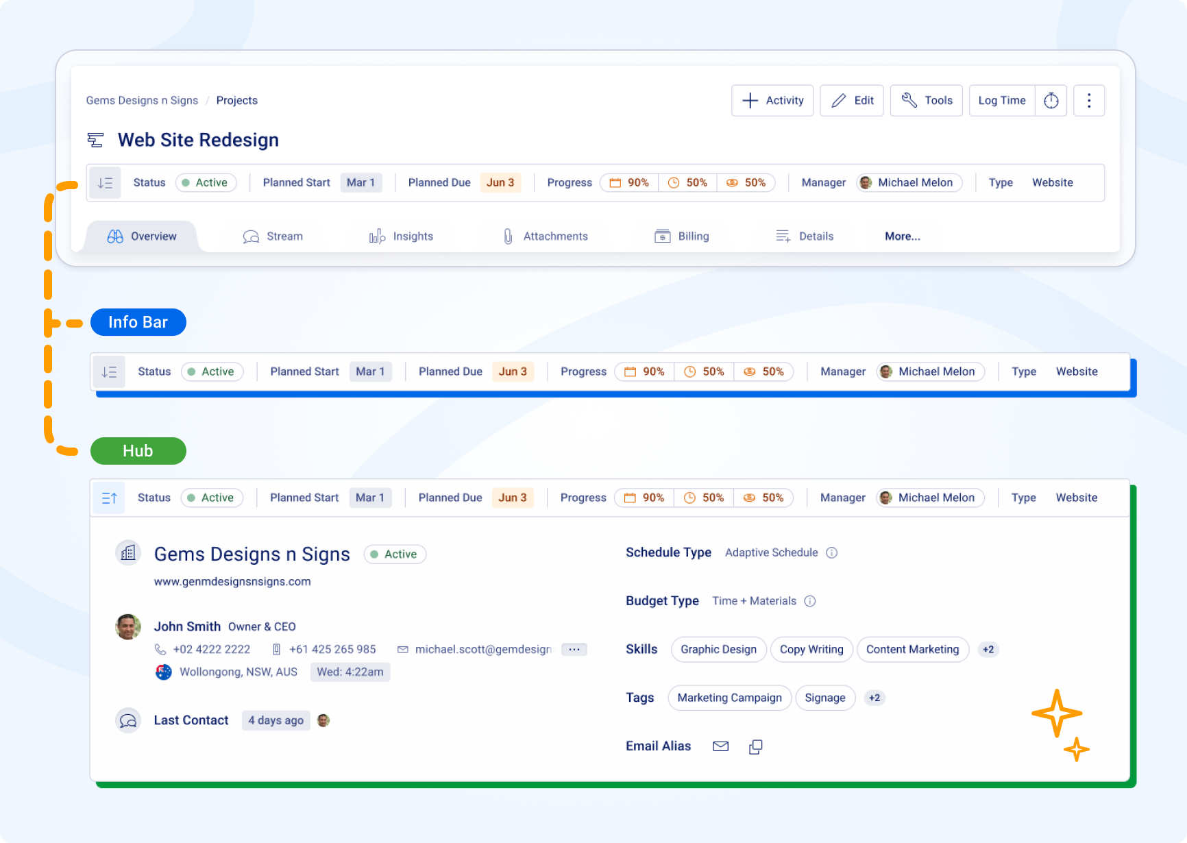
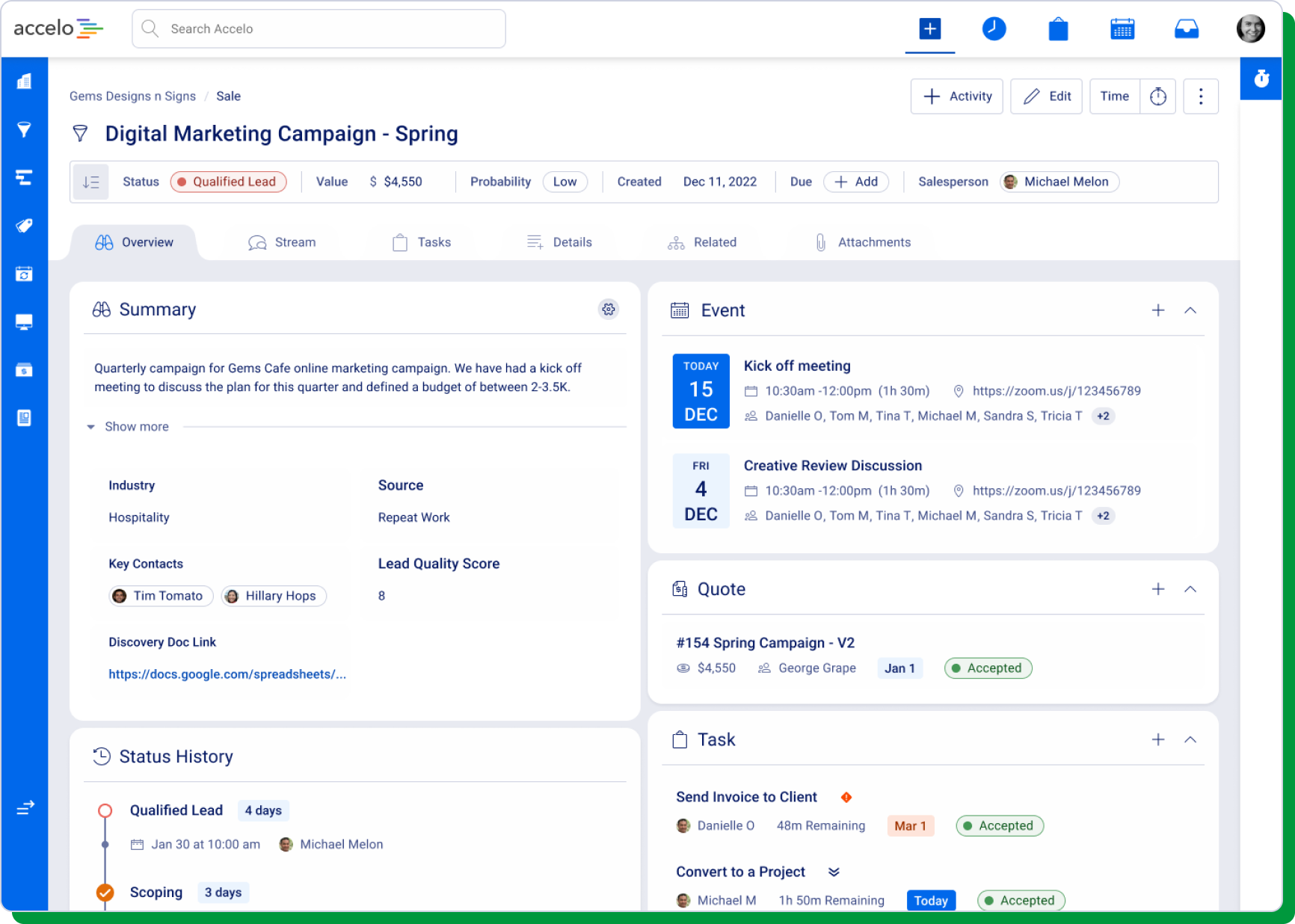
The first part of Accelo v4 we released is now available in public beta. In this update, we focused on helping salespeople and managers understand where every opportunity is at a glance — with summaries and meetings (now known as events) now prominent whenever you go to view a Sale. Additionally, we’ve brought important custom fields and quotes into the new Sales Overview, and now you can easily see the history of a sales opportunity to ensure you’re staying on top of velocity.
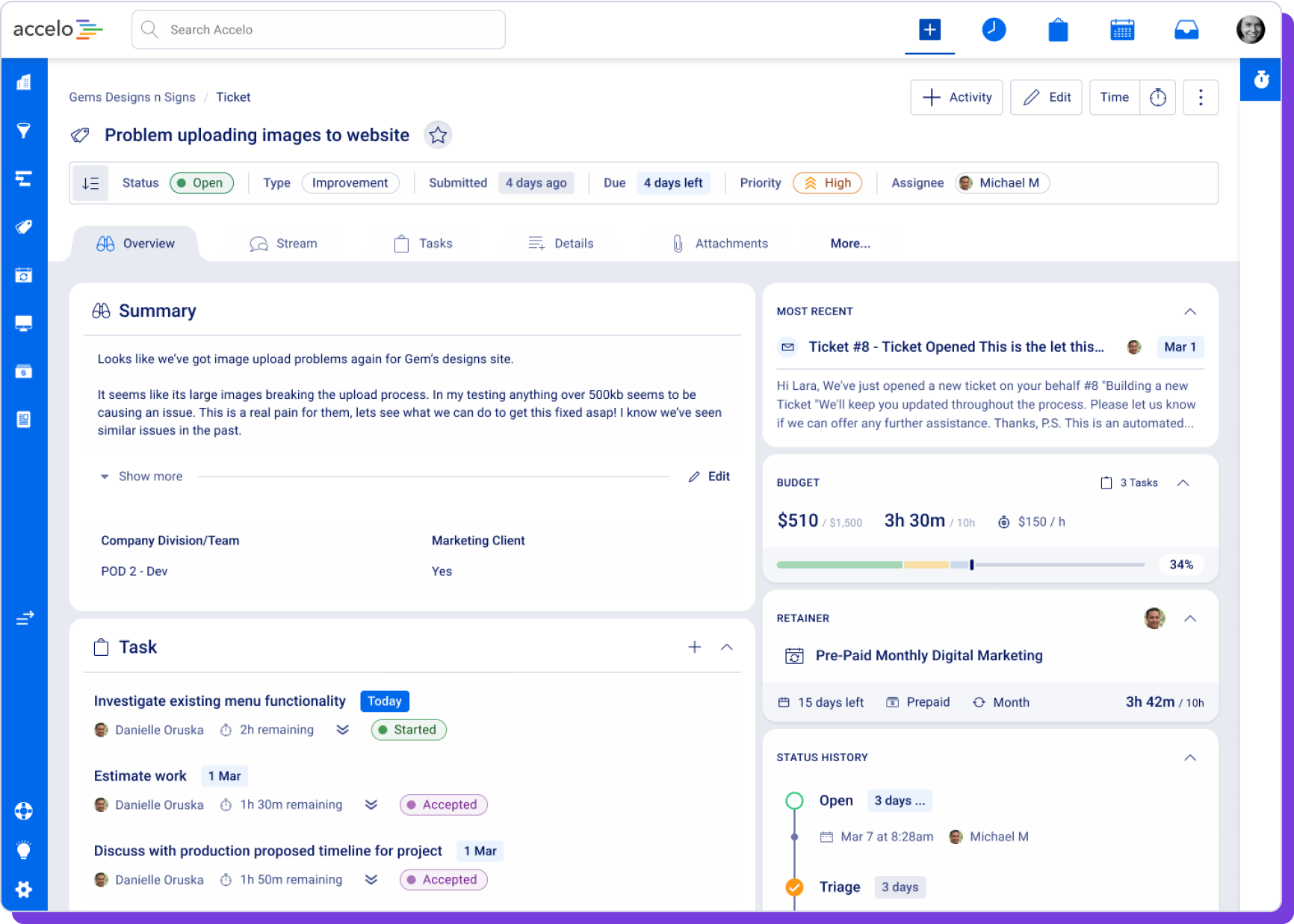
The Ticket view, which we released in alpha back in May, is also now available in public beta. For this view, we focused on helping service team members to understand what needs to be done with a prominent display on the left of the screen. We also elevated the placement of important custom fields in the Overview interface. On the right of the view, we make it easy to see the last client interaction — because knowing who last worked on something, and when, is so critical to delivering great service. The Overview also includes the history of the ticket to understand the work that has been done already.
As you’ll see in our Accelo v4 progress update post, we’re also working on upgrading the description of a Ticket to support rich text (bold, italics, links, etc).
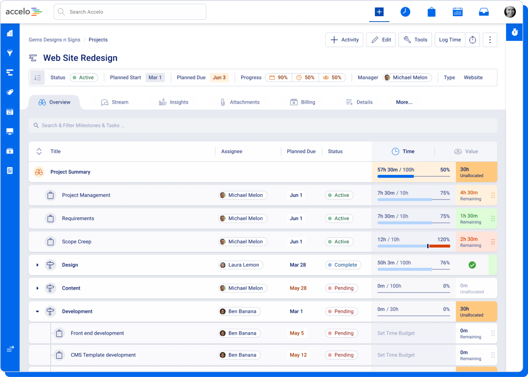
The Project view, which we released in alpha back in October, is now also available in public beta. We focused on the breakdown of the project through its milestones and tasks, with an emphasis on key dates and either time or financial budget information always available. We’ve kept the focus on Flood Bars to show how things are progressing at a glance and since there’s now a lot more information underneath the Flood Bar, we used a new hover effect to make it easier to see the contributions to usage and budgets.
The Project view is the first place we introduced our new Drawers functionality. These Drawers are panels that slide in from the right-hand side of the screen to provide additional information without you needing to leave the screen. We’ll be using them a lot more in Accelo v4 as we roll out more screens into 2024. You can access a Project Drawer for detailed budget information, as well as a Drawer for each Milestone or Task, by clicking on them. See below for more details about our Task upgrade.
As you’ll see in our Accelo v4 progress update, we’re also working on upgrading the Project Insights tab to use the new Accelo v4 technology. In the meantime, clicking on the Insights tab will direct you to the Classic view Insights tab, with all the same real-time data.
Given Accelo v4 is all about making our product easier to use, we’ve introduced a brand-new Task experience with our new version. While the old task experience was powerful — with checklists, dates, budgets and more — it was also a bit unwieldy. Because of this, we’ve put a lot of work into simplifying the user interface and moving it so you can interact with tasks without covering almost all of your screen.
This new pattern, which we call a Drawer, allows the interface for creating a Task and viewing a Task to slide out from the right-hand side. This allows you to see more of what is on your screen than the old UI, and we’ve also simplified the creation and viewing process to be less intimidating while remaining powerful.
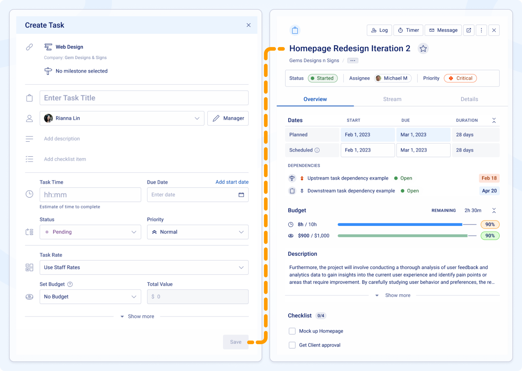
As you’ll see in our Accelo v4 progress update, we’re keeping the older interface for creating and viewing Tasks on screens that haven’t been upgraded yet. We can’t wait to make the new experience available universally!
Tracking the work you’ve done for your clients is a critical part of Accelo, and we also know this work can happen in a variety of ways. It could be an internal log of work, an email you’ve sent to your client or colleagues or a meeting you’ve booked (be it in person or on a call). Either way, tracking your activity as you do work for clients is key.
Prior to Accelo v4, we had a large, and sometimes confusing, interface for logging these activities. We also had a separate interface for logging your time and work, which actually went into the same place even though it looked different.
With the Accelo v4 upgrade, we’ve made a few big changes to simplify the experience. There are now three separate interfaces that are more clearly labeled and designed to be easier to use:
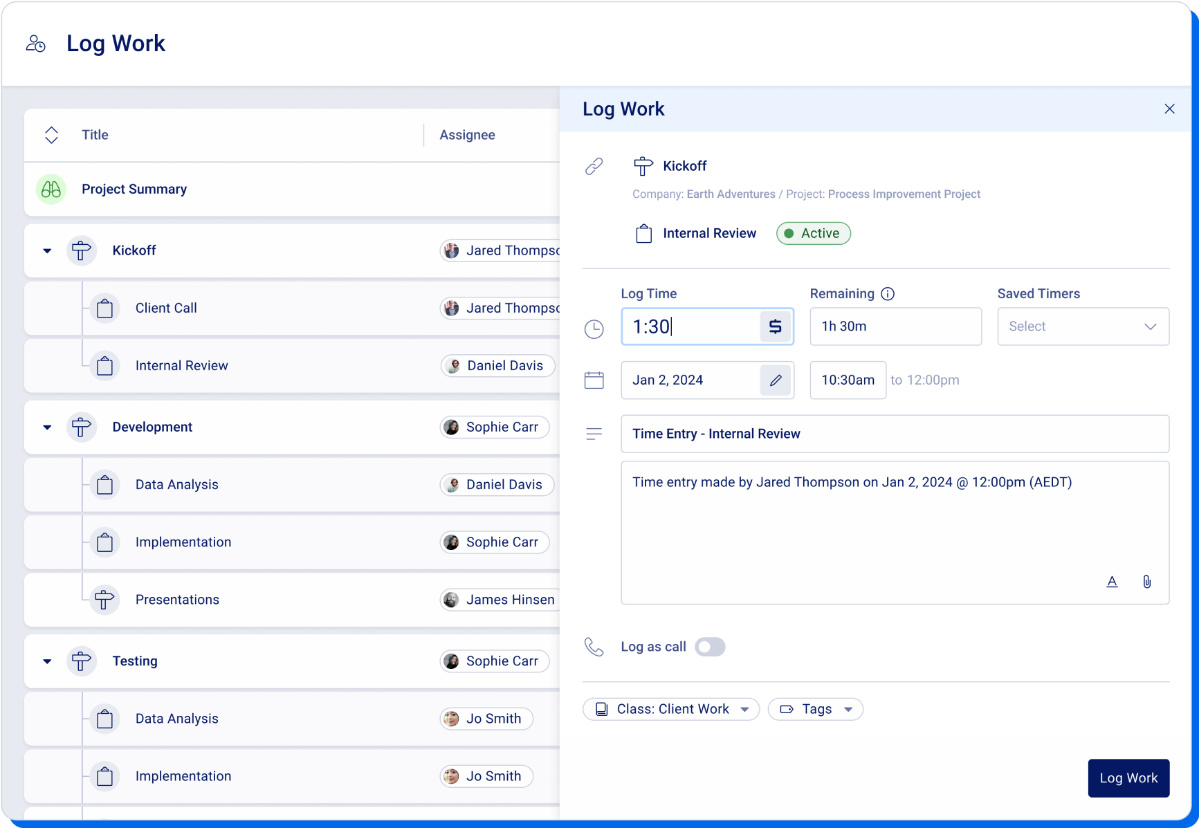
Log Work. This is similar to the old Log Time experience, or creating a quick note in the Stream. The focus is on logging time and/or providing details about your work. This is also where logging a call happens due to our users sharing that the old approach was a bit confusing and left them wondering if they were sending an invite to a call or just entering that one had happened.
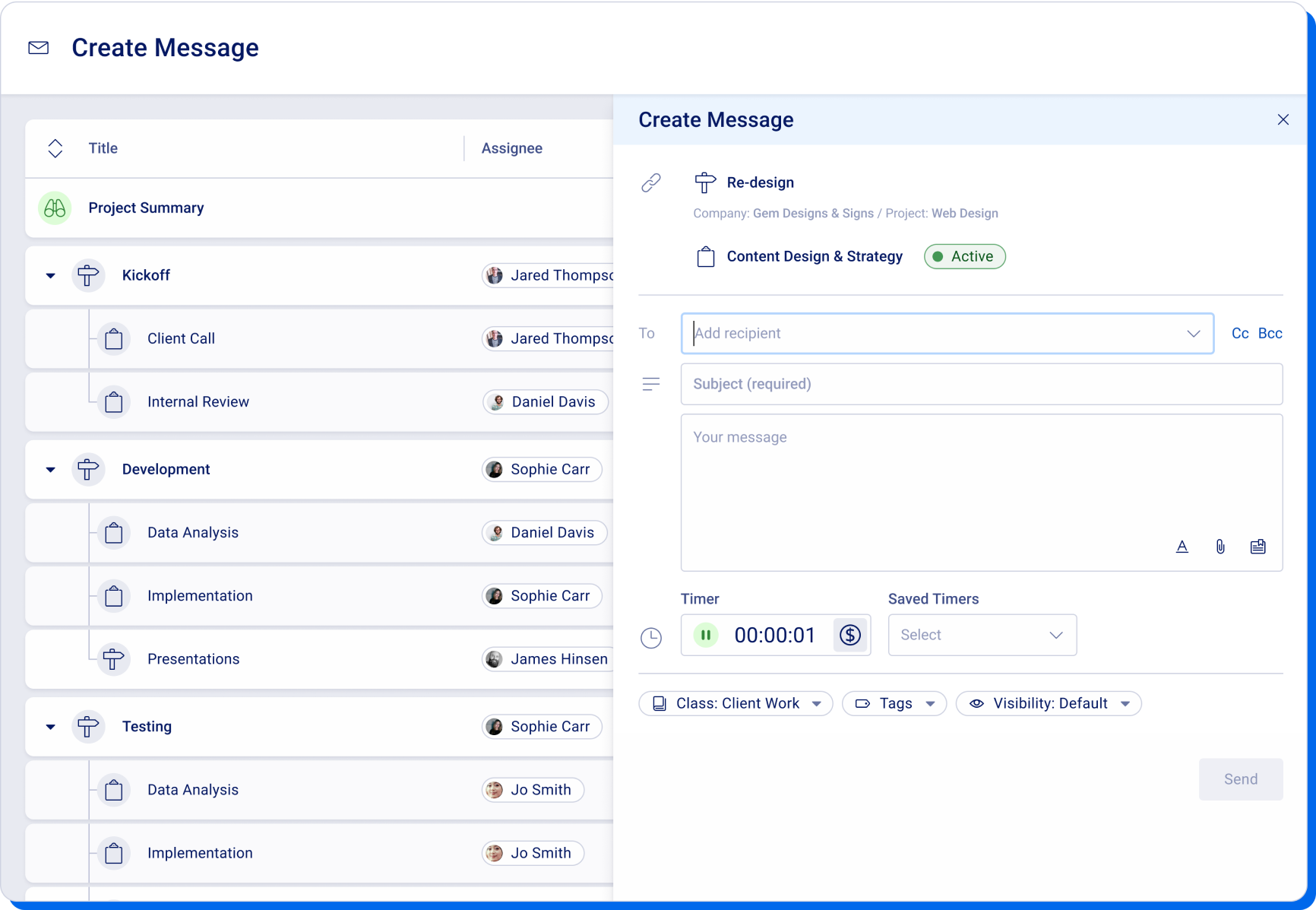
Create Message. This is the same as the old Email type of activity or a Note sent to a colleague, and it is a supercharged Compose experience. In addition to recipients, subject, body (with rich text) and attachments, the Message interface also includes live time tracking, privacy settings and more. We decided to rename it to Message to be more consistent with other products our clients are using.
Create an Event. This is the same as the old Meeting type of activity, and it handles the same sorts of things you’d expect from creating an event in Google Calendar or Microsoft 365. The decision to rename it from Meeting to Event was to be more consistent with the other products our clients are using and allow it to be more flexible (since so many client and team events are actually Zoom calls and not in-person meetings).
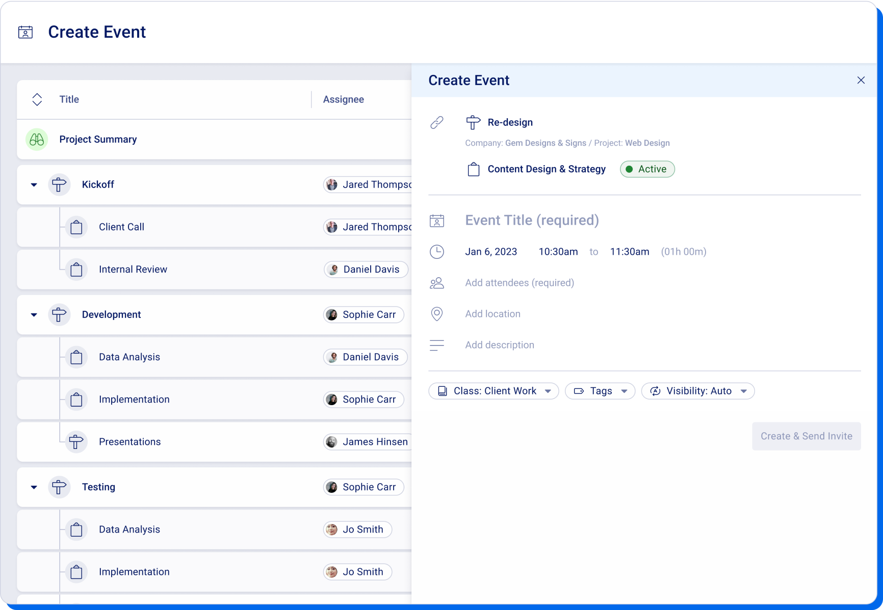
As you’ll see in our Accelo v4 progress update, we’re keeping the older interface for creating activities on screens that haven’t been upgraded yet. We can’t wait to make the new experience available universally!
The following improvements are upcoming enhancements to our v4 beta screens:
First, an admin user of your account must turn on v4 Beta Accessibility. Then, users will be able to individually opt in to the beta experience.
The following toggle will become available on the General Settings page:
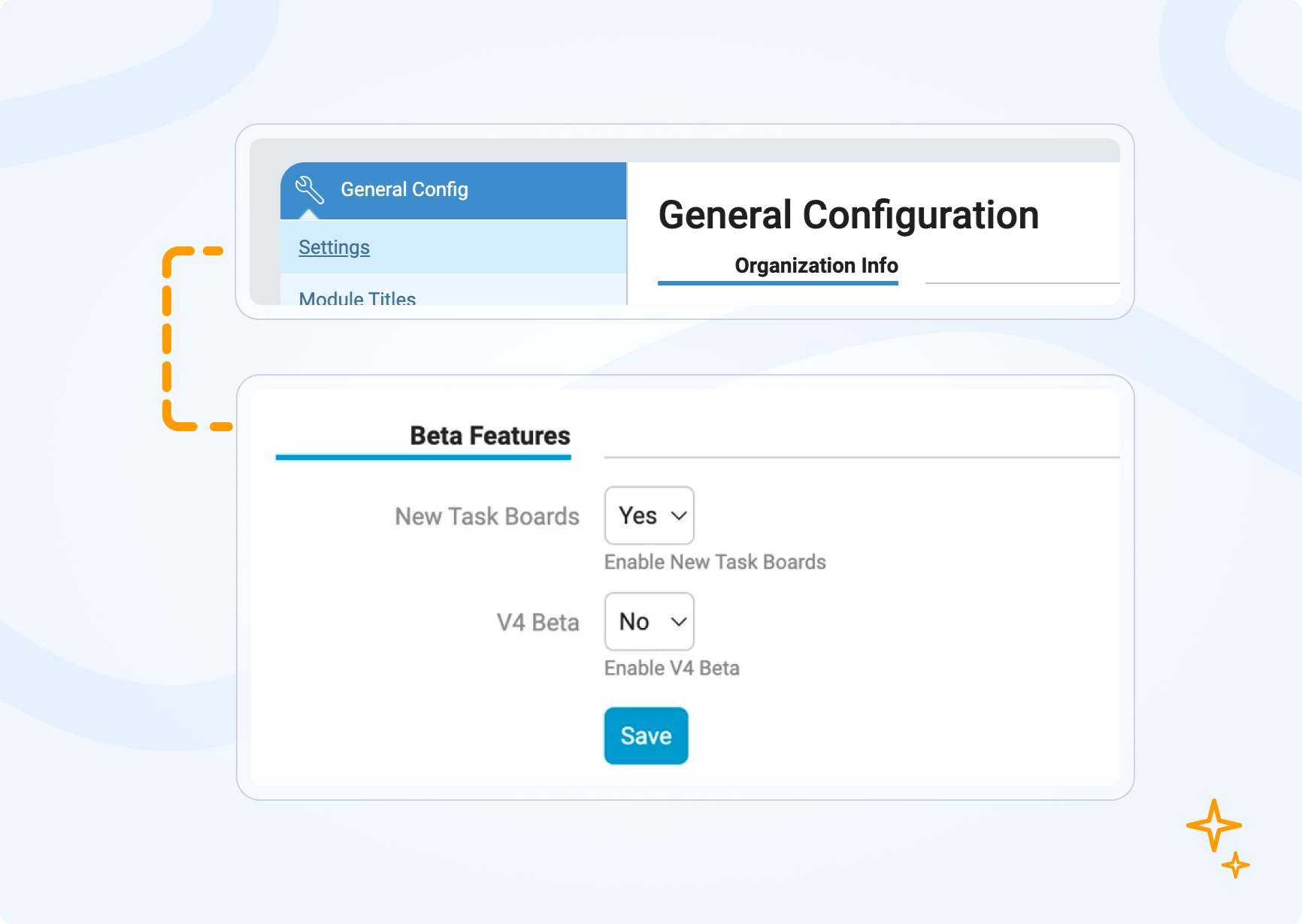
To disable, an admin user may access this screen and toggle v4 Beta to No. When an admin user toggles v4 Beta off, v4 Beta will be disabled for all account users regardless of their user settings. Their user setting is remembered, so if an admin toggles v4 Beta back on, the user's previous setting will take effect again.
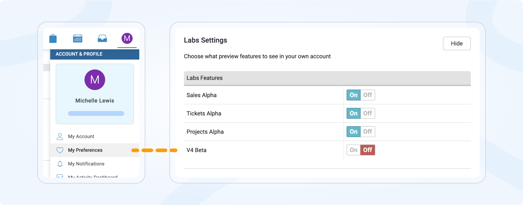
When an account has v4 Beta Accessibility turned on, all users of the account will have the option of toggling v4 Beta on and off for themselves.
Users can do so from User Preferences:
In each of the new Accelo v4 view screens, you will see an in-app "Share Feedback" button that allows you to provide your feedback and suggestions. There will be a short series of questions that you are able to answer in this survey.
You will also have the ability to create new ideas on the Ideas Forum, using the "Feedback" button in the bottom left-hand menu of Accelo. When creating a new idea, please make sure to put your idea into the correct v4 Feedback category.
In an effort to make the product simpler to use and due to extremely low usage, the following features will no longer be supported in Accelo v4.
We hope you enjoy the new Accelo v4 beta experience! If you haven't already, make sure to check out our Accelo v4 Progress Update for more details about what's still to come. And once you've had a chance to explore the beta, we encourage you to share your feedback. We look forward to hearing from you!

