Accelo Acquires Forecast, Adding Depth to AI and Capacity Planning Capabilities
Read the Press Release


At Accelo, our vision is to revolutionize how professional services businesses deliver client work. We do this by providing the most powerful platform for managing client work from quote to cash, and we have thousands of clients doing billions of dollars of work each year to prove it.
However, we know that there are millions of professional services businesses that are still using a cocktail of different tools to try and get through the day — costing each of them thousands of dollars a month due to the inefficiency, budget overruns and inevitable errors that come with kluging together a bunch of platforms that aren't designed to deliver client work.
Our Product Vision in 2024 is to deliver an easier-to-use product without sacrificing the power of the platform. This is critical to ensure thousands of additional businesses — and tens of thousands of new users — can easily adopt and succeed with our transformational technology.
When it comes to technology, there's often a tradeoff between having powerful technology versus having technology that is simple to use. The more capabilities — be they features, preferences, configurations or even whole modules — the more challenging it is to make them easy to use.
Given the scale of our ambition — to manage all of the client work in a business, from quote to cash, in one platform — we feel this challenge acutely.
Now, it would be understandable to just throw up our hands and say "if you want all the power, you'll have to accept there's a lot of complexity." And you could argue that is what the companies who came before us have done.
When we set out on the journey to deliver Accelo v4 over a year ago, we considered making the product easier to use by removing features and capabilities — it didn't sit right, but it was definitely the fastest way to make the product simpler. But from talking to our clients, we heard loud and clear that having the power of a true client work management platform, with the ability to manage clients, work, tasks, time and billing all in one place, was the secret sauce, the biggest benefit to their business.
So, despite the difficulty, we've accepted the challenge to deliver a powerful product that is also easy to use and our continued journey of delivering that solution underpins our Accelo Product Vision for 2024.
The challenge of delivering a product that is both powerful and easy to use is massive. The metaphor we're using internally to think about it is how Boeing was able to make their flagship aircraft for decades — the 747 — much easier to fly.
First flown commercially in January 1970, the "jumbo jet" was the world's first wide-body airliner, and with over double the passenger capacity of the 707 that came before it, it is credited with making flying affordable for the masses. However, for the crew, these were incredibly complex beasts to fly.

Source: 707Jet.com
For the next 20 years, all 747s required a crew of three at all times - two pilots and an engineer. With almost 1000 switches in the cockpit, they were the definition of power and complexity.
By the time of Boeing's v4 of the 747 — called the 747-400 — they decided to make a massive change to simplify the cockpit with technology. It almost broke the company, but while it was a lot of work, it turned out to be their most successful 747 ever. Within five years it was being used by 83 airlines and even became Air Force One (source).

Source: Adobe Stock
While still intimidating, the 400 saw almost two-thirds of the switches eliminated, making it much easier to fly. Importantly, they didn't sacrifice power. The 747-400 actually increased power, capacity (25% more passengers) and safety features.
While we're not dealing with anything nearly as complex as an airliner, we think there's a lot of inspiration to draw from the lesson of the 747 — retaining power while improving ease of use.
In some respects, we're well on our way with the release of Accelo v4 into public beta late last year. As we look ahead into 2024, our focus will be to continue on this journey — including not just the new view screens of Accelo v4 but also other areas of important product use. We will be delivering these improvements as they're ready, so you'll see more view screens get delivered each quarter throughout the year, while other improvements like multi-assignee on tasks will be delivered as soon as they're ready
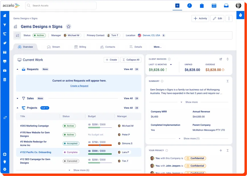
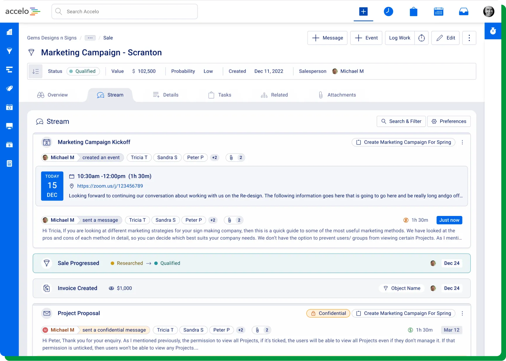
With our launch of Accelo v4 into beta last month, we've delivered new Sale, Project and Ticket view screens (along with a new UI for Tasks and Activities). We're continuing to put our foot on the gas, with the new view screens to come including Company, Contact and Retainer views. We'll continue working on the remaining view screens through the course of the year, balancing the priorities of delivering less used screens (eg, View Asset) against other improvements to make the product easier to use.

The version of the Stream we shipped in the beta isn't where our Accelo v4 journey will end. Early in 2024, we'll be delivering an upgraded version of the Accelo v4 Stream, making it easier to filter, search and interact with the Stream — both on the view screen as well as within the right-hand side drawers.

While the work we did for Custom Lists underpinned a lot of the back-end capabilities we then went on to use in Accelo v4, we have heard from our users that the UI for these lists isn't as good as it can be. Given the amount of use our List screens get every day, and given their role as a gateway into the rest of the product, improving the user experience of our Lists and making Boards (with columns for drag and drop) much more widely available are key areas of focus to improve the ease of use of Accelo.
While it isn't a whole new set of screens, we are focusing on making Accelo easier to use by making it easier for users to make changes to their data. We’re doing this by delivering more in-line editing. Our initial focus is going to be on the new view screens — especially the Details tab and the most commonly used custom fields — but we'll be extending this approach to any screen we can (hopefully including our improved List screens). While it might seem small (and with the complexity of dependencies and permissions, is actually quite challenging from an engineering perspective), we know that this change will improve ease of use for many of our users.
This is one of the biggest user experience challenges for us to overcome: how to make navigating a big and powerful product easy. Our previous attempts at this — focusing on search as the primary interface — haven't worked out as well as we'd hoped (feedback shows people want to find what they’re looking for with just a click or two). Because of this, we know new navigation is the biggest thing we can do to make the product easier to use, especially for casual or new users.
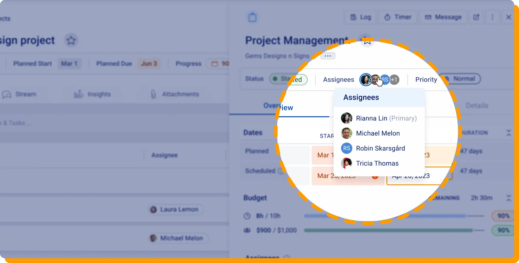
We're close to being able to allow our users to assign multiple additional team members to Tasks — our most requested feature. This will make it easier for people using Accelo to work the way they want to work — eliminating things like splitting tasks or other workarounds that make things more difficult than they need to be when you're tackling client work as a team.

Few things can make a product easier than not having to use it at all! That's what we're doing with Accelo Payments, allowing our users to automatically bill their own clients — often for automatically created invoices! Accelo Payments, now available in beta to all clients in the US, is going to continue to get easier to use, with more ways to capture or set up client payment methods and additional support for clients in other countries getting added through 2024.
Similar to the in-line editing experience, we’re making it possible for users to use bullets, in-line images, clickable links and more in their descriptions of Tickets and Tasks. This will make it easier to communicate and to know what needs to be done without resorting to linking out to other documents or places.
Part of making the product easier for some users without removing the power and capabilities for other users is treating users differently through what we call Personas. This persona-driven approach is something we're going to start supporting through the creation of a series of "home screens" for different types of users. We expect this will reduce the pressure on the Navigation to make sure it can be everything for everyone, and we also plan to harness this persona-driven approach in our New Navigation as well as View screen options/defaults into the future.
Almost no one likes to track their time, but in professional services, the most successful businesses depend on it to understand the costs and profitability of their client work. Given the importance of these screens, we'll be prioritizing improvements to our Timesheet and Approval experiences in the second half of 2024 — harnessing the capabilities of our new technology to deliver screens that are easier and faster to use.
While it might not be obvious to everyone, sending emails that actually get delivered is getting harder and harder due to some very good security reasons. To help our clients use Accelo's email capabilities just as easily as they use their own Gmail or Outlook interface, we're making changes to how emails from Accelo are delivered to clients. This will mean a user can easily search in Accelo or their email client to find things they've written in either location, reducing friction while maximizing security and deliverability.
We're publishing a yearly Product Vision for the first time to share our commitment to making Accelo both powerful and easy to use, and to highlight that we know how critically important ease of use is for our users. From the initial feedback with Accelo v4's beta, this vision for 2024 is also aligned with what our clients and the market are looking for.
Of course, choosing to focus on one thing means not focusing on other things. While we're focusing on improving ease of use of our already powerful product, we're naturally not putting as much emphasis on making the product even more powerful. This means that areas of additional power — such as adding multiple currency support or launching additional languages — aren't a priority in 2024. These things are still important to us, and we're confident that with the new technology underpinning Accelo v4 and a better user experience this year, we'll be well-placed to deliver additional power without scaring away users down the track.
We've been heartened by the amazing feedback that our clients have provided during the Accelo v4 journey — from concept to alpha to private beta and then beta launch — and we're excited to invite our thousands of clients on this journey with us. While we'll be publishing updates here on our blog, we'll be publishing more frequent news for our users at community.accelo.com, and we're also about to relaunch our Ideas Forum at ideas.accelo.com to make it easier to keep up to date with specific improvements we're making.
Finally, I want to shout out to our dozens of Product, Design, Engineering and QA team members who collectively poured over 2,000 hours of their heart and soul into making Accelo better every single week. Thank you for your hard work and passionate commitment to helping our clients succeed every single day.

